
Found this beautiful poster on a design blog and immediately fell in love with the typeface.
I had to know what it was.
So I took to what the font to see which typeface it was.


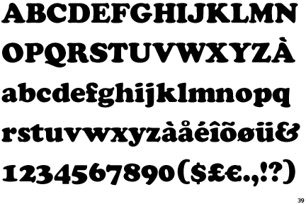
What the font is hit and miss (miss on most occasions) but it managed to pick it out and detect it to be Cooper light. I thought I recognised some of the characteristics from Cooper black.
Cooper black is a heavy rounded typeface which has a very friendly aesthetic and is often used poorly, however the light version has strong elements of Cooper black (rounded serifs, which give off a friendly aesthetic). But is less intense.

with the label's name. I tried it in both lower and uppercase and lowercase italic.
I've also tired out the full name 'Owl Records'
Personally, I think the top 'Owl' works best. I just believe the type looked really well with a short, singular word.
No comments:
Post a Comment