Showing posts with label MARINA TYPEFACE. Show all posts
Showing posts with label MARINA TYPEFACE. Show all posts
Wednesday, 29 May 2013

Tuesday, 28 May 2013
Marina typeface poster.


Today, I used my print slot to print an A2 poster for Marina typeface.
I basically used the same elements from a previous poster and rearranged the composition


The printed poster!


Really pleased with how this came out. I printed the poster A2 on off white sugar paper and was a tad skeptical that the colours may look too dull on the off white paper but I think the stock has made it even better. Also it's made the colours not too bright but still dynamic.
Saturday, 18 May 2013
Perspex MARINA
I'm thinking about applying my typeface on coloured perspex. Typically stencil typefaces are applied to plastic to be used in school or other uses.
It'd be interesting to see how Marina works in this format. It seems really late to be doing this but I can always show it at the End of Year Show.


To keep my options open I continued searching and found this other source. Suspiciously, the photograph is the same but at least I could phone 'The plastic People' for verification.

They even have the option for drilled holes
For the exhibition I could screw the pieces to the wall (somehow) I may discuss with Amber, during the tutorials, how feasible this is. If this isn't possible, I could create solid stencil sheets and place them on the shelf along with the specimen booklet.
I'm thinking about applying my typeface on coloured perspex. Typically stencil typefaces are applied to plastic to be used in school or other uses.
It'd be interesting to see how Marina works in this format. It seems really late to be doing this but I can always show it at the End of Year Show.


I'm thinking of using solid coloured perspex.
So I started looking around to see where I could get some coloured perspex sheets. I first started on eBay and found this good, reliable seller.


They even have the option for drilled holes
For the exhibition I could screw the pieces to the wall (somehow) I may discuss with Amber, during the tutorials, how feasible this is. If this isn't possible, I could create solid stencil sheets and place them on the shelf along with the specimen booklet.
Monday, 6 May 2013
Typeface development.
This is the process I'm going through with each letterform.
I'm using DIN as a guide. I then placed a rounded rectangle over the T
and placed rectangles in the negative space.


This was the end result. I'm pretty happy with the 0.5mm (even though I should be working in pts)
It's not too harsh on the letterform and adds a nice rounded edge.

The plan is to go through this process for each character. I've already noticed it not working so well for other characters such as the G as seen below.

However, I plan to go on ahead and see how the whole alphabet looks after going through the process.
I also plan to print off some tests tomorrow.
This is the process I'm going through with each letterform.
I'm using DIN as a guide. I then placed a rounded rectangle over the T
and placed rectangles in the negative space.


This was the end result. I'm pretty happy with the 0.5mm (even though I should be working in pts)
It's not too harsh on the letterform and adds a nice rounded edge.

The plan is to go through this process for each character. I've already noticed it not working so well for other characters such as the G as seen below.

However, I plan to go on ahead and see how the whole alphabet looks after going through the process.
I also plan to print off some tests tomorrow.
Back to the drawing board.
After nearly finishing the initial look of the typeface, I took time to look back and realised there were too many inconsitancies for the typeface to work. What worked for my Vinkel typeface (last module) was that it was abstract and didn't nessaverily follow the usual conventions of type design, therefore I was free to do what I wanted. Therefore I decided to revisit what I was initially set out to do. Create a typeface based on letters found on sailboats.
My current one resembles Din too much and if I were to scale each character up for the end of year show, the mistakes would reveal themselves, I want the typeface to be dynamic and totally my own.
 However, I'm still keen on basing the typeface on the dimensions (widths) of Din.


I started by creating a rounded rectangle around Din's letterforms. This was to get the widths right.

For example, the width for the letters A and B are totally different.

I then began cutting into the shapes to reveal the letterforms.

This was the final result for 'E'.

I then thought what it would look like if i applied round corners to the letterform.
And it's come out pretty well. A few corners may need tweaking.

After nearly finishing the initial look of the typeface, I took time to look back and realised there were too many inconsitancies for the typeface to work. What worked for my Vinkel typeface (last module) was that it was abstract and didn't nessaverily follow the usual conventions of type design, therefore I was free to do what I wanted. Therefore I decided to revisit what I was initially set out to do. Create a typeface based on letters found on sailboats.
My current one resembles Din too much and if I were to scale each character up for the end of year show, the mistakes would reveal themselves, I want the typeface to be dynamic and totally my own.


I started by creating a rounded rectangle around Din's letterforms. This was to get the widths right.

For example, the width for the letters A and B are totally different.

I then began cutting into the shapes to reveal the letterforms.

This was the final result for 'E'.

I then thought what it would look like if i applied round corners to the letterform.
And it's come out pretty well. A few corners may need tweaking.

Sunday, 5 May 2013
Spotting more problems


I discovered a good way of spotting faults (in this case uneven curves) whilst designing a typeface, is to rotate the letterform. I'm not sure if this is correct but once I rotated this letterform I noticed the curves for the counter were uneven despite them looking even (enough) when straight.
THIS NEEDS FIXING
Typeface so far / evaluation

Here it is so far. I've missed out on a few characters such as G as I didn't feel ready to takle it yet.
However, it's looking pretty good so far. The O is pretty similar to Din's 'O' as well as the I but I think this is to be expected. The crossbar of E and F may need looking at again but I'm just going to crack on for now.

Here it is so far. I've missed out on a few characters such as G as I didn't feel ready to takle it yet.
However, it's looking pretty good so far. The O is pretty similar to Din's 'O' as well as the I but I think this is to be expected. The crossbar of E and F may need looking at again but I'm just going to crack on for now.

Digitising the typeface.
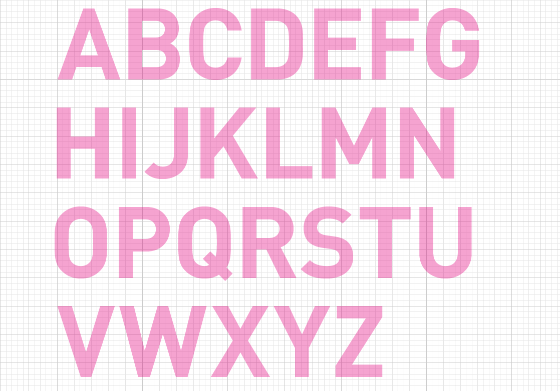
I started by typing out the alphabet in 200pt DIN Bold. This was for a number of reasons.
The first being that I wanted my typeface to fit within the dimensions of Din. The second being that Din is the typeface which has a simular look to the one I saw on the sail in cornwall.


I then began drawing letterforms, using Din as a guide.

I used the rounded corners option as it made my life a lot easier. The corner radias being 2.83pt.

THE FINISHED LETTERFORM.
Pretty happy how it turned it. In hindsight, I should've started with characters like R and S and D so it shows the rules and characteristics of the typeface but I felt more comfortable going through it by the alphabet and if anything needs correcting or changing, I can come back to whatever letterform needs attention.
I started by typing out the alphabet in 200pt DIN Bold. This was for a number of reasons.
The first being that I wanted my typeface to fit within the dimensions of Din. The second being that Din is the typeface which has a simular look to the one I saw on the sail in cornwall.

I then began drawing letterforms, using Din as a guide.

I used the rounded corners option as it made my life a lot easier. The corner radias being 2.83pt.

THE FINISHED LETTERFORM.
Pretty happy how it turned it. In hindsight, I should've started with characters like R and S and D so it shows the rules and characteristics of the typeface but I felt more comfortable going through it by the alphabet and if anything needs correcting or changing, I can come back to whatever letterform needs attention.
More typeface sketches
So yesterday, I spent the whole day drawing out more letterforms for the Marina typeface.

There are not perfect yet but I wanted to sketch out the main shape of each letterform before I spent hours drawing it neatly. The dimensions of the typeface itself has come from DIN, so it shouldn't be too hard to add my own characteristics.


So yesterday, I spent the whole day drawing out more letterforms for the Marina typeface.

There are not perfect yet but I wanted to sketch out the main shape of each letterform before I spent hours drawing it neatly. The dimensions of the typeface itself has come from DIN, so it shouldn't be too hard to add my own characteristics.


Tuesday, 23 April 2013
Marina typeface plan


Decided to write up a plan for the Marina typeface brief. This includes the list of deliverables (at this point in time)
I also plan to design a specimen book.
DEADLINE TO FINISH THE TYPEFACE (Thursday Afternoon)
This deadline allows me to apply it to the printed material and start
the exhibition.
I plan for the exhibition to be held at the Martine Museum.
I plan for the exhibition to be held at the Martine Museum.


Subscribe to:
Posts (Atom)